A versatile card design for Expedia that seamlessly adapts to desktop viewing, either within a carousel or on canvas, and offers a smooth mobile experience without a reduction in size.
Project overview
I was tasked with the design of a collection landing experience for Expedia, as well as a redesign of the hotel product cards. The product cards were to have key content for potential guests that pertained to the collection they were shown in (ie: unique descriptions, points of interest, photo gallery).
My role
Research
Design
User testing
User acceptance testing
The team
Researcher
2 UX designers
Product owner
Development
Tools used
Figma
JIRA
Confluence
Wordpress
The before
Prior to this initiative, the product cards had reached a point where an increasing amount of content was being squeezed into a limited space, causing challenges in terms of user-friendliness and technology. The addition of a column-based design for these cards also created significant issues, particularly in the context of translating content for non-English-speaking users.
As you can see, there were a number of product cards being used which created an inconsistent shopping experience for users.
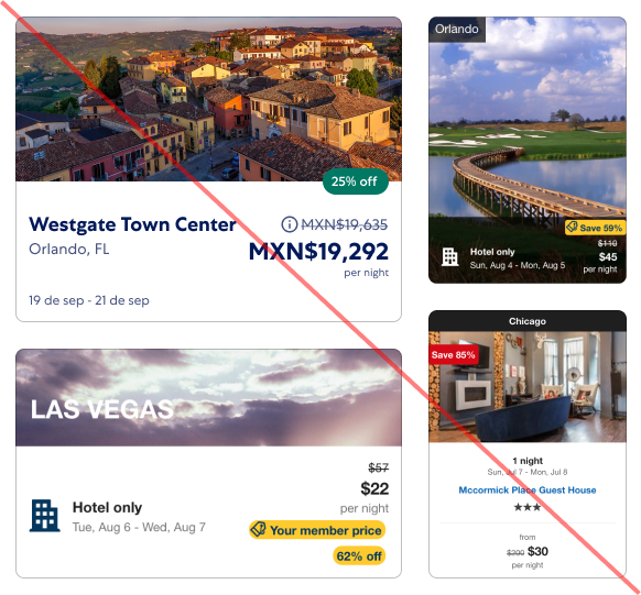
What worked
Imagery
Deal badging (concept)
Strike-thru pricing
What didn’t work
Non-standard image ratios
Inconsistent pricing
Different visual designs
Inconsistent font sizing
Inconsistent badging
New requirements
Image ratios within design system
Image gallery
Consistent pricing
Unique descriptions
Ability for localization
User review rating
Consistent badging
The after
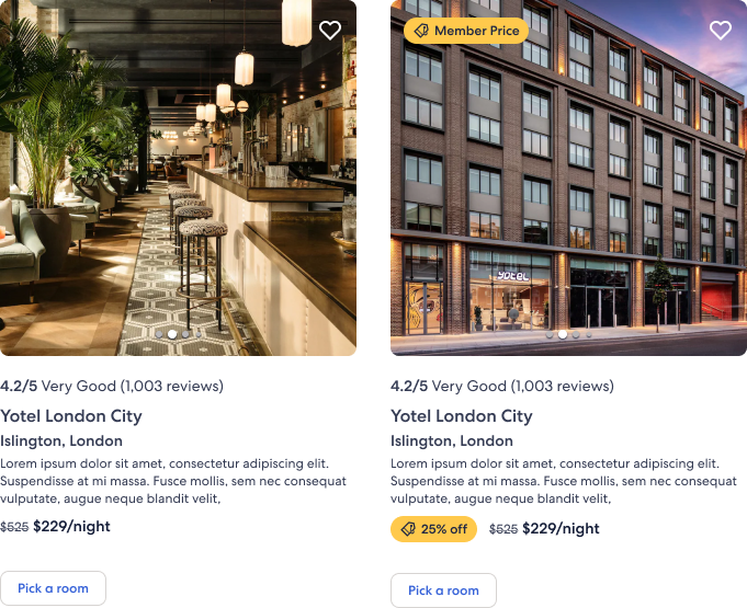
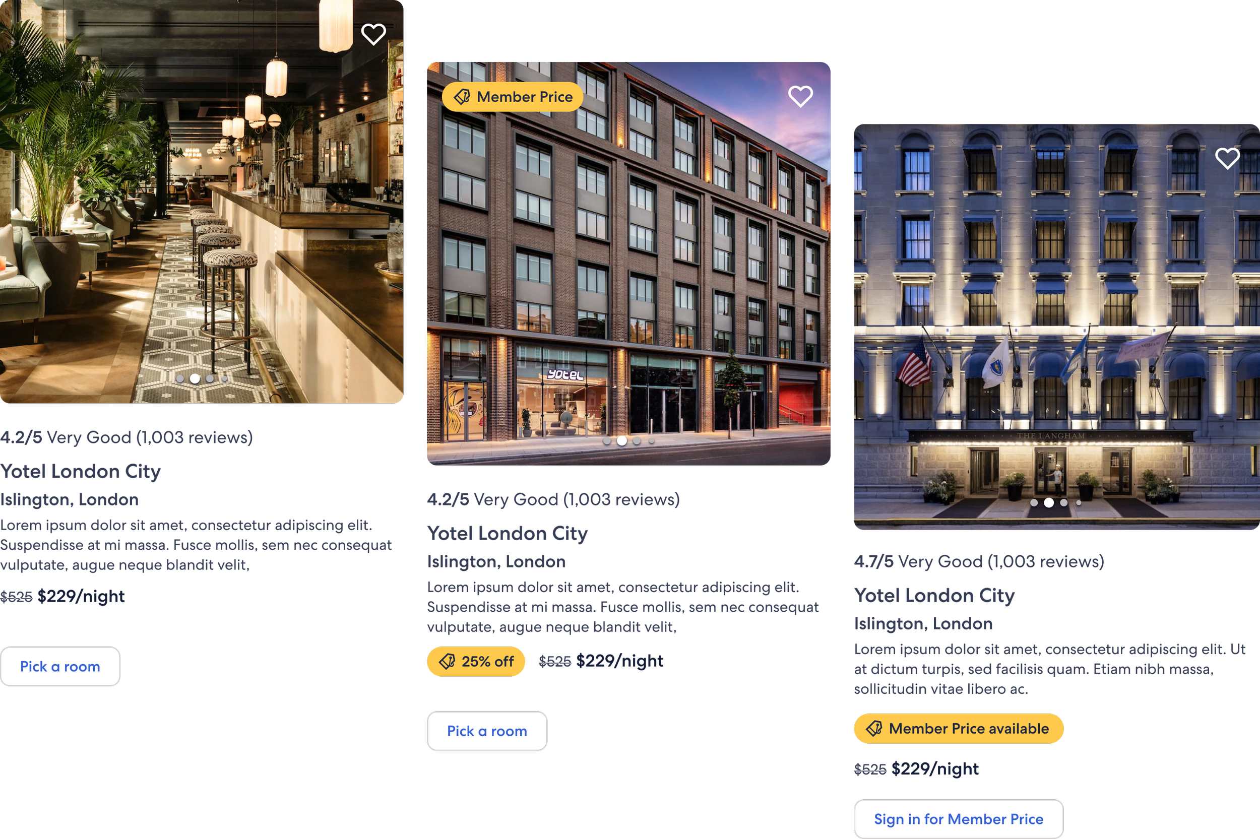
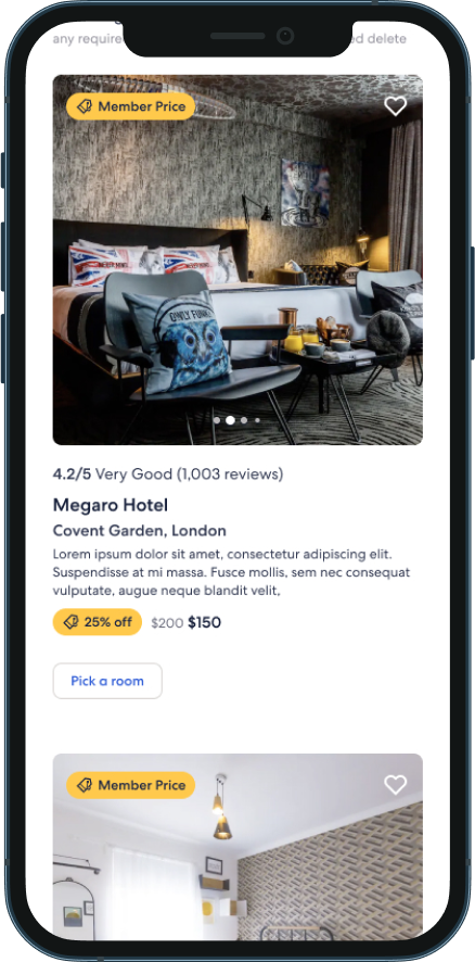
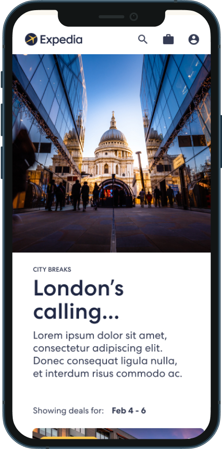
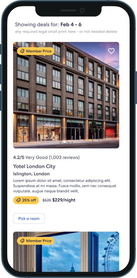
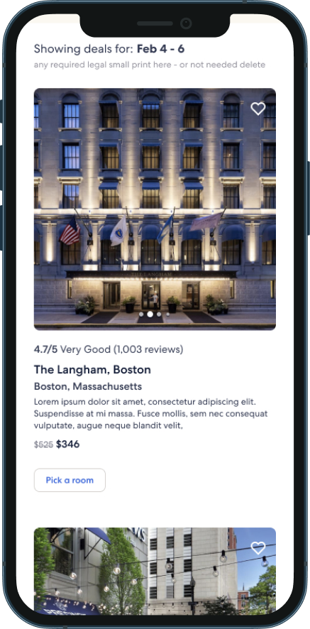
Following numerous iterations and valuable user input, this featured product card design was implemented for the product launch in 2022. This versatile card design seamlessly adapts to desktop viewing, either within a carousel or on canvas, and offers a smooth mobile experience without a reduction in size.
The 1:1 image ratio, complete with an interactive gallery, provides customers with a preview of the property without leaving the page. Additionally, we integrated essential data points, including user reviews, property name and location, a dedicated area for unique marketing text, and simplified pricing, ensuring a well-rounded and engaging user experience.
Collections
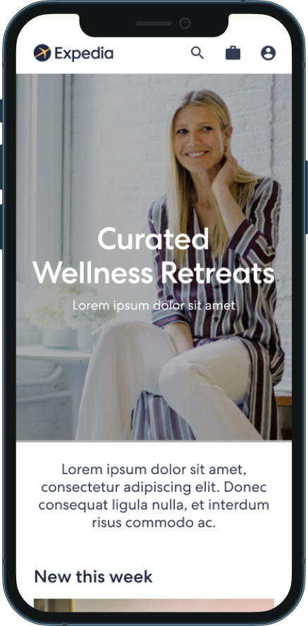
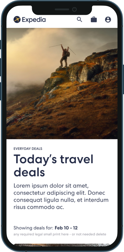
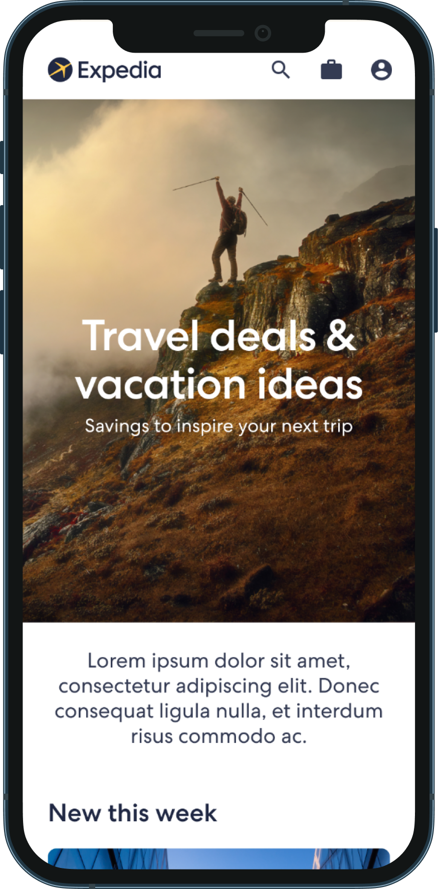
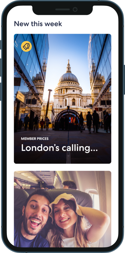
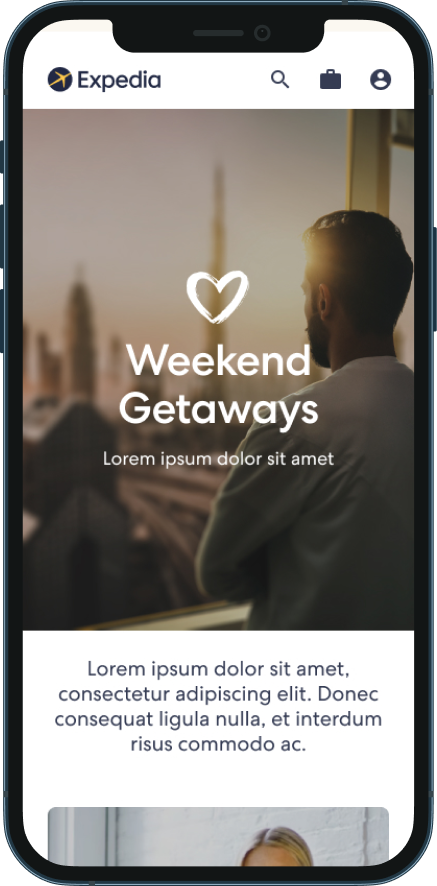
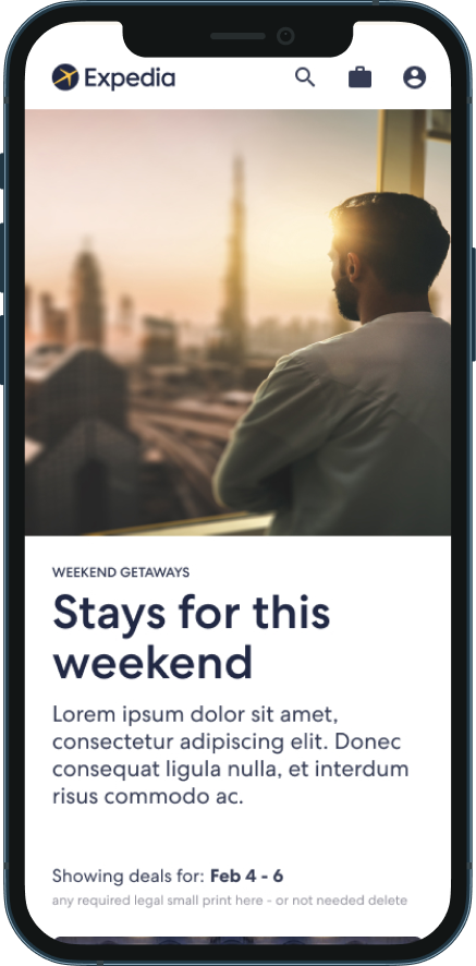
With the launch of the product cards, we were able to seamlessly integrate them into a new merchandising campaign known as collections. The concept of collections was initially conceived during the early phases of homepage design and continued through the creation of new engagement emails and marketing campaigns. These collection pages served as a space to showcase a variety of trip themes, including spring getaways, city breaks, last-minute trips, and evergreen travel deals.
Metric driven results
Throughout the process of redefining and redesigning the product cards, product shopping experienced a boost in engagement rates, surpassing previous versions by over 8.5 times the previous versions.
Furthermore, after migrating our landing pages to this new structure, we witnessed a more than twofold increase in the impression rate.
"Heather is a pleasure to work with! She communicates clearly and easily and I trust her expertise completely. She absolutely demonstrates the value of Go Get Whats Next in our organization. She continuously develops forward thinking content and customer experiences that inspire the rest of us to drive our capabilities forward to match."
— Senior Manager, Product Transformation, Expedia Group